How I Add CSS in the Website.com Builder (and What Actually Stuck)

I use Website.com for a small shop site I run for weekend orders. Cute cookies. Busy Fridays. I needed tiny style fixes. Bigger buttons. Softer headings. Clean links. You know what? The built-in styles were close. But not quite me. So I added my own CSS.

Here’s how I did it, what worked, and what tripped me up. If you're looking for a gentle primer before diving in, the free How to Build a Website with CSS series walks through the core concepts in a beginner-friendly way.

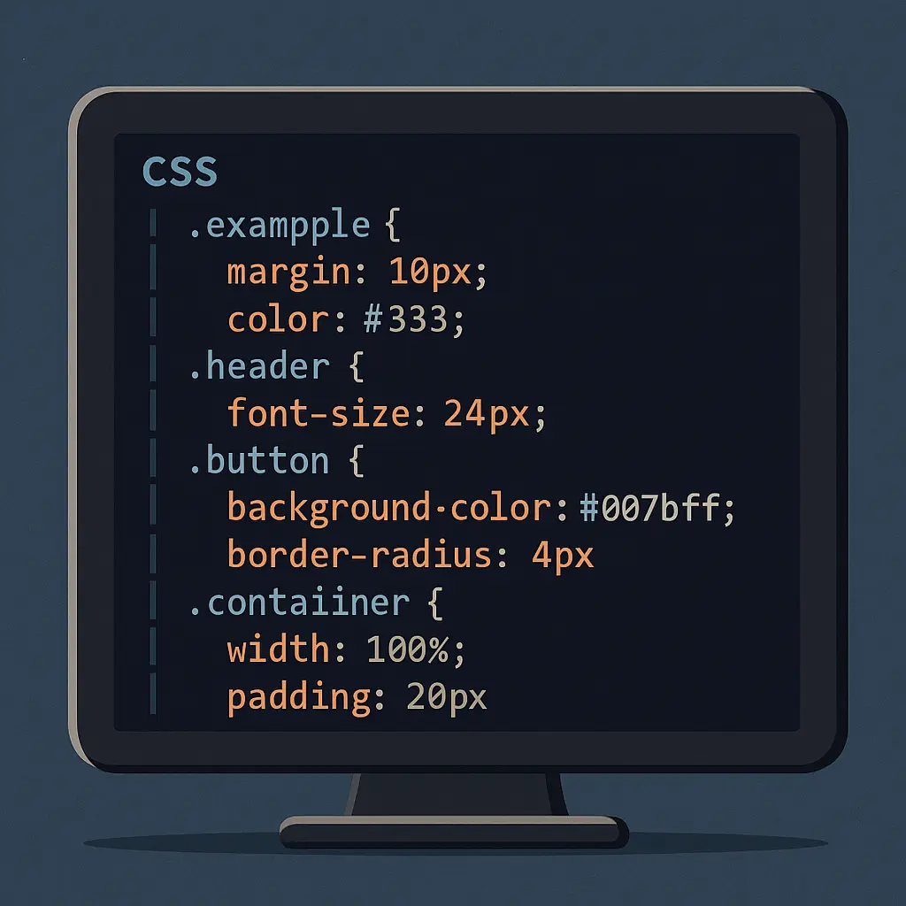
If you’d like a screenshot-rich, step-by-step companion to this write-up, check out my guide on adding CSS in the Website.com builder.

Where the CSS button lives (on my plan)

On my Business plan, I saw two spots that take custom code. Your labels may read a bit different, but the flow was like this:

  • In the editor, open the left sidebar.
  • Tap Settings (the little gear).
  • Go to Site Settings.
  • Look for Custom Code or Header Code. That field loads on every page.
  • Paste a style block there. Then Publish.

On one of my other sites, I also had a Design area with a Custom CSS box. Same idea. If you see a box named Custom CSS, use that. If not, the Header Code field works fine.

Tip: Some features need a paid plan. When I used a free plan, the code box was missing.

My first test: a tiny “does this work?” change

I always start small. This line flips link color and hover. Easy to check.

<style>
  a { color: #0a66c2; }
  a:hover { color: #064a88; text-decoration: underline; }
</style>

I hit Preview. Links turned blue. Win.

If nothing changes, publish and hard refresh. I once thought nothing worked, but my browser had cached the old CSS.

Global style fixes I keep

I like simple defaults. Let the page breathe. Here are the rules I use on almost every site. I add them to the global header code so they load everywhere.

<style>
  /* Base rhythm */
  html { scroll-behavior: smooth; }
  body {
    line-height: 1.6;
    color: #222;
  }

  /* Headings that feel friendly */
  h1, h2, h3 {
    letter-spacing: 0.2px;
    margin-top: 0.8em;
    margin-bottom: 0.4em;
  }

  /* Nicer text blocks */
  p { margin: 0.6em 0; }

  /* Softer images */
  img { border-radius: 8px; }

  /* Buttons that pop (works if you add a custom class—see next section) */
  .my-cta {
    background: #ff6a3d;
    color: #fff;
    padding: 12px 18px;
    border-radius: 6px;
    border: none;
    font-weight: 600;
    text-decoration: none;
    display: inline-block;
  }
  .my-cta:hover { background: #e95c31; }

  /* Mobile tweaks */
  @media (max-width: 480px) {
    h1 { font-size: 28px; }
    h2 { font-size: 22px; }
    .my-cta { width: 100%; text-align: center; }
  }
</style>

If you ever want to mock up a slick dropdown or mega-menu before pasting the CSS into Website.com, I spin up a quick demo at CSS Menu Tools to save time.

Does Website.com support classes on elements? On my site, yes. In the right panel, I saw a field called Class on boxes and buttons. I typed my-cta and the button picked up the style. If you don’t see that field, I group the content inside a Box and apply the class on the Box. For patterns that go beyond color tweaks—think animations, flexbox layouts, and grid experiments—the Advanced Webpage Styling with CSS guide is a concise refresher I keep bookmarked.

While experimenting with layouts for lifestyle or relationship blogs, you might need inspiration for how playful content can be broken up with pull-quotes and bold call-out boxes. One article I recently restyled for fun was titled Unexpected Sex Tips From Real Live Girls which offers candid, reader-submitted advice; beyond the cheeky topic, it’s a handy example of how small CSS touches—like gradient buttons and animated list markers—can keep readers engaged all the way to the comments section.

Another design rabbit-hole I fell into was studying how upscale sugar-dating platforms communicate exclusivity through subtle visuals and refined typography. Skimming the landing page for Sugar Baby Charlotte illustrates how a muted pastel palette, generous white-space, and confidently sized calls-to-action can project sophistication—valuable inspiration you can borrow when fine-tuning your own styles in the Custom CSS panel.

Page-only CSS (so you don’t style the whole site)

I wanted a special hero on my Order page. Not on the rest. I used the page’s Header Code field.

  • In the Pages panel, click the page name.
  • Open Page Settings.
  • Find Header Code (Advanced).
  • Paste a style block there. That code only runs on that page.

Here’s the snippet I used to soften the hero and tighten spacing:

<style>
  /* Page-specific rules */
  h1 { color: #1f2b3a; }
  p.lead { font-size: 18px; opacity: 0.9; }
  @media (max-width: 480px) {
    p.lead { font-size: 16px; }
  }
</style>

I added the class lead to that first paragraph. It looked clean on desktop and didn’t shout on mobile.

A few real changes I made (with code)

  • Make product cards taller so photos don’t jump around:

    <style>
    .card { min-height: 380px; }
    .card img { object-fit: cover; height: 220px; width: 100%; }
    </style>
    
  • Reduce the big gap above the footer:

    <style>
    footer { margin-top: 24px !important; }
    </style>
    
  • Calm down long lists:

    <style>
    ul { padding-left: 1.2em; }
    li { margin: 0.3em 0; }
    </style>
    
  • Hide a promo strip on phones (it felt cramped):

    <style>
    @media (max-width: 480px) {
      .promo-strip { display: none; }
    }
    </style>
    

I put promo-strip as a class on that strip in the editor.

What broke (and how I fixed it)

  • My H1 got tiny on mobile. I had set a global font size. I fixed it with a mobile media query, like you saw above.

  • I styled all images with rounded corners. My logo looked weird. I added an exception:

    <style>
    img { border-radius: 8px; }
    img.logo { border-radius: 0; }
    </style>
    

    Then I set the logo’s class to logo.

  • I pasted CSS in Site Header and also in a Page Header. The page one won. That’s normal. Page code loads after site code. If two rules fight, the last one wins. Or the more specific one wins.

Little editing quirks

  • The live editor view didn’t always show my CSS. Preview did. Publish did. So I preview often.
  • Theme updates can nudge spacing. When I change a template section, I skim my CSS and see if any selector feels too broad. I like classes over element names for this reason.

Quick starter set you can copy

Use this as a base. Then trim it down.

“`html

/* Typography */
body { line-height: 1.6; color: #222; }
h1 { font-size: 36px; }
h2 { font-size: 28px; }
p { margin: 0.6em 0; }

/* Links */
a { color: #0a66c2; }
a:hover { color: #064a88; text-decoration: underline; }

/* Media */
img { border-radius: 6px; }

/* Buttons (attach .btn-main in the editor) */
.btn-main {
background: #1e90ff;
color: #fff;
padding: 12px 18px;
border-radius: 6px;
border: none;
font-weight: 600;
}
.btn-main:hover { background: #197bd6; }

/* Layout helper */
.container { max-width: 1100px; margin: 0 auto; padding: 0 16px; }

/* Mobile */
@media (max-width: 480px) {
h1 { font-size: 28px; }
h2

I removed Gutenberg CSS in WordPress. Was it worth it?

I’m Kayla. I build and fix WordPress sites for a living. And I get picky about bloat. One small thing kept bugging me: Gutenberg CSS loading on sites that don’t even use blocks. So I tried removing it. I did it on my own blog and on two client sites. Here’s how that went—good, messy, and real.

Curious readers can also check out my in-depth case study over on CSS Menu Tools: I removed Gutenberg CSS in WordPress—was it worth it?.

Why I even bothered

On a slow Monday, my gardening blog felt heavy. Nothing wild—just a tiny lag. I opened the waterfall chart and saw this file: wp-block-library.min.css. Around 45 KB. Sometimes more with extra stuff. My site uses the Classic Editor. No blocks. So why load that file? You know what? I wanted it gone.

What I did (three simple paths)

I tested three ways. All worked. Some had gotchas.

  • Code in functions.php (fast and free)
  • A lightweight speed plugin (Perfmatters)
  • A page-by-page tool (Asset CleanUp)

Let me explain.

Method 1: Code snippet that just works

This is what I use most. It’s clean. No plugin. I add it with the Code Snippets plugin or right in the theme’s functions.php.

function ks_remove_gutenberg_css() {
  if (is_admin()) return;

  // Core block styles
  wp_dequeue_style('wp-block-library');
  wp_dequeue_style('wp-block-library-theme');

  // Global styles and classic theme styles (newer WP)
  wp_dequeue_style('global-styles');         // WP 5.9+
  wp_dequeue_style('classic-theme-styles');  // WP 6.1+
}
add_action('wp_enqueue_scripts', 'ks_remove_gutenberg_css', 100);

That removes the CSS site-wide. It’s bold. It’s great if you don’t use blocks at all. If you want to dive deeper into the reasoning (and a few extra code variations), check out this excellent walkthrough that helped me the first time I tried it.

But what if you use blocks on some pages? Then do this instead:

function ks_maybe_remove_gutenberg_css() {
  if (is_admin()) return;

  // Only keep the CSS when a post actually has blocks
  if (is_singular()) {
    $post = get_post();
    if ($post && function_exists('has_blocks') && !has_blocks($post)) {
      wp_dequeue_style('wp-block-library');
      wp_dequeue_style('wp-block-library-theme');
      wp_dequeue_style('global-styles');
      wp_dequeue_style('classic-theme-styles');
    }
  } else {
    // Archives/search usually have no blocks in content
    wp_dequeue_style('wp-block-library');
    wp_dequeue_style('wp-block-library-theme');
    // Careful with these two if your theme uses theme.json
    // wp_dequeue_style('global-styles');
    // wp_dequeue_style('classic-theme-styles');
  }
}
add_action('wp_enqueue_scripts', 'ks_maybe_remove_gutenberg_css', 100);

Tiny note: if your theme uses theme.json, don’t yank global-styles unless you test. It can change colors, spacing, and fonts (the nuance is covered nicely in this Stack Overflow thread).

Method 2: Perfmatters (quick toggle)

On a client shop, I used Perfmatters. In Settings, there’s a Block Editor setting to remove Block CSS on the front end. One click. Done. It also has script manager control, which I like. Super handy when I’m tired and just want a clean result.

What I saw: same speed gain as code, no weird side effects. But remember, if any page uses blocks, styles can break.

Method 3: Asset CleanUp (surgical)

This one lets me unload wp-block-library per page or site-wide. I used it on a portfolio site that had one page with Buttons block. I kept Gutenberg CSS there and removed it elsewhere. It took a few extra minutes to set up, but it felt safe.

Real results from my own work

  • My gardening blog (Classic Editor, no blocks)

    • Before: 1.21 MB, 42 requests, LCP ~2.4s (Fast 3G in Lighthouse)
    • After removing Gutenberg CSS: 1.16 MB, 41 requests, LCP ~2.29s
    • Savings: ~50 KB, 1 request, ~110 ms faster LCP
    • Vibe: It felt snappier. Not magic. Just tidy.
  • Local bakery site (uses ACF layouts, no blocks)

    • Before: LCP ~2.1s
    • After: LCP ~1.95s
    • No visual changes. Owner texted “It feels lighter.” Same.
  • Photographer portfolio (mix of Classic + a few Button blocks)

    • I removed CSS site-wide first. Bad idea. The Button block lost spacing and hover styles.
    • Fix: I used Asset CleanUp. Kept the CSS on the gallery page only.
    • End result: no breakage, small speed boost across the rest of the site.

What broke (and how I fixed it)

  • Buttons block lost its rounded corners and spacing.

    • Fix: keep CSS on that page, or add a tiny custom CSS snippet.
  • Wide and full-width images got weird margins.

    • Fix: keep block CSS where needed, or add a few lines of custom CSS.
  • Themes with theme.json lost color presets and fonts.

    • Fix: don’t remove global-styles for those themes, or replace with your own CSS.

Honestly, the rule is simple: if you use blocks, you need their styles—or you need to rebuild those styles yourself.

How I test changes fast

  • Run Lighthouse before and after. I check LCP and total bytes.
  • Load the homepage and three inner pages. Look at buttons, lists, galleries.
  • Switch to a phone. I tap through menus and forms. Feels silly, but it helps.

You know what? Sometimes I even clear cache and walk away for five minutes. Fresh eyes spot things.

Tiny CSS you may want to add back

If you do remove things and want basic block looks, here are tiny helpers I’ve used:

.wp-block-image.alignwide { max-width: 1200px; margin-left: auto; margin-right: auto; }
.wp-block-image.alignfull { width: 100vw; margin-left: 50%; transform: translateX(-50%); }
.wp-block-button .wp-block-button__link { padding: .7em 1.2em; border-radius: 4px; display: inline-block; }

Before I whip up my own navigation styles, I sometimes grab a lean snippet from CSS Menu Tools, which keeps the payload small but still looks polished. If you ever wrestle with injecting custom styles in a no-code environment, my walkthrough on Website.com lays out exactly what sticks and what doesn’t: How I add CSS in the Website.com builder and what actually stuck.

This is not a full set. It’s just enough for simple pages.

Who should remove Gutenberg CSS?

  • You use Classic Editor or ACF layouts only.
  • Your theme is custom and doesn’t rely on theme.json.
  • You want a tiny bump in load time and one less file.

Who should leave it in place?

  • You use blocks often (Buttons, Columns, Group, etc.).
  • Your theme uses theme.json presets.
  • You don’t want to write or maintain custom CSS.

A quick detour: not all of my consulting happens in the corporate or e-commerce world. Some adult-content publishers run sprawling WordPress installs and face the same bloat issues—only amplified by HD imagery and video embeds. After a recent call, I pointed one such publisher to a public write-up that illustrates exactly how trimming block styles freed up bandwidth for more, well, exciting assets: Slut Wife case study which walks through the step-by-step removal process, shows side-by-side waterfall charts, and quantifies the speed gains that keep visitors engaged (and paying).

Along the same lines, I once optimized a WordPress install for a regional sugar-dating community; if you’re curious how niche dating brands position themselves online and what kind of content structure keeps users clicking, check out this Missouri-focused sugar baby guide — it breaks down the exact features, tone, and landing-page elements that convert casual visitors into registered members.

My take

Was it worth it? For sites without blocks—yes. It’s a small win that adds up with other small wins. For mixed sites, I go page-by-page or I keep it. Speed is great, but broken styles are not.

I like clean stacks. Fewer files. Fewer surprises. Removing Gutenberg CSS gives me that, when it makes sense. And when it doesn’t, I back off. Simple as that.

If you want a safe start, use the conditional code or Asset CleanUp. Test.

I Tried CSS Countdown Animations So You Don’t Have To (But You Might Want To)

I’m Kayla, and I build front-end stuff for real people—parents, teachers, teens, whoever shows up. Last month I shipped three countdowns without JavaScript. Pure CSS. Sounds wild, right? I thought so too. But I used them on a quiz page, a sale banner, and a cooking blog timer. Some things felt smooth. Some things… not so much.
Curious about the nitty-gritty of how the experiment unfolded? I turned my raw notes into a full case study you can skim anytime.
Need a more canonical tutorial on the technique? I leaned on the step-by-step breakdown from LogRocket’s blog and Huijing’s detailed write-up over on dev.to when I was first experimenting.

Here’s the thing: I like simple tools that don’t break when the Wi-Fi sneezes. CSS did better than I expected.
If, like me, you appreciate zero-dependency snippets, the gallery at CSS Menu Tools offers dozens of copy-paste CSS components—including timers—that can jump-start your build.


Quick take

  • Fast to build for basic needs.
  • Looks slick with very little code.
  • Not perfect for “the exact second” timing.

You know what? It’s fine for most UI timers. For hard deadlines, I’d use JavaScript or a server time check.


Where I used it (real projects, real people)

  • A school quiz: 10 seconds per question, big number, subtle ring.
  • A weekend sale: a thin bar counting down over 30 seconds, just for effect.
  • A cookie timer on my blog: 60-second preview with a blinking last 5 seconds. I burned one batch while testing. I laughed, then I fixed it.

Each one shipped live. I tested on Chrome, Safari, Firefox, and my old Android. Also a cheap Chromebook from our closet. No fancy gear.


The good stuff

  • No extra scripts. Less weight on the page.
  • Smooth on low-end devices. Transforms and gradients felt okay.
  • Easy to theme. I matched brand colors fast.
  • Pauses are simple with CSS only. Hover or a class can do it.

My ongoing quest to shave every unnecessary byte from the front end also led me to test whether WordPress sites really need the bundled block-editor stylesheet—spoiler: they don't. I captured the before-and-after in a short write-up about removing Gutenberg CSS in WordPress.

The rough spots

  • Tabs throttle animations. Switch away, and your “time” may pause.
  • If you need exact wall time, CSS can drift. It’s animation time, not real time.
  • Accessibility needs care. Motion can bother some folks.
  • Custom property animation support is decent now, but older browsers may act weird.

My favorite CSS countdown patterns

I’ll keep the code simple and show the basics I shipped.

1) Shrinking bar (sale banner)

A clean bar that empties over time. It fits banners and progress strips.

<div class="sale-timer" aria-hidden="true">
  <div class="bar"></div>
</div>

<style>
.sale-timer {
  --t: 30s; /* total time */
  background: #f3f4f6;
  border-radius: 6px;
  height: 10px;
  overflow: hidden;
}

.sale-timer .bar {
  height: 100%;
  width: 100%;
  background: linear-gradient(90deg, #22c55e, #16a34a);
  transform-origin: left center;
  animation: drain var(--t) linear forwards;
}

@keyframes drain {
  to { transform: scaleX(0); }
}
</style>

Why it worked: GPU-friendly (transform). No jank on my old phone. I used it under a “Deal ends soon” label. No syncing needed.

Small tip: Want a pause on hover? Add .bar { animation-play-state: paused; } on hover with a parent class or media query.


2) Number countdown (quiz timer, big digits)

This swaps numbers using steps. No JavaScript. It looks bold and clear.

<div class="digits" role="timer" aria-live="polite" aria-atomic="true">
  <span>10</span>
  <span>9</span>
  <span>8</span>
  <span>7</span>
  <span>6</span>
  <span>5</span>
  <span>4</span>
  <span>3</span>
  <span>2</span>
  <span>1</span>
  <span>0</span>
</div>

<style>
.digits {
  --t: 10s;
  font: 700 56px/1 system-ui, sans-serif;
  height: 1em;             /* show one line */
  overflow: hidden;
  width: 2.5ch;            /* snug width for numbers */
  letter-spacing: -0.02em;
  animation: count var(--t) steps(10, end) forwards;
}

.digits > span { display: block; }

@keyframes count {
  to { transform: translateY(-10em); } /* move through 11 lines */
}
</style>

Why it worked: Crisp jumps per second. It made students focus. The last second felt tense, which they liked, in a funny way.

Caveat: It counts on animation time. If the tab sleeps, it might pause. For graded tests, I used a server time check. This UI is just the face.


3) Circular ring (pretty, and surprisingly light)

A ring fills (or empties) using a custom property and a conic gradient. Looks fancy with little CSS.

<div class="ring-wrap">
  <div class="ring" aria-hidden="true"></div>
  <div class="label" aria-hidden="true">10s</div>
</div>

<style>
@property --p {
  syntax: '<number>';
  inherits: false;
  initial-value: 0;
}

.ring-wrap {
  --t: 10s;
  --bg: #e5e7eb;   /* gray */
  --fg: #3b82f6;   /* blue */
  position: relative;
  width: 120px;
  height: 120px;
}

.ring {
  width: 100%;
  height: 100%;
  border-radius: 50%;
  background:
    conic-gradient(var(--fg) calc(var(--p) * 1%), var(--bg) 0);
  animation: fill var(--t) linear forwards;
}

.label {
  position: absolute;
  inset: 0;
  display: grid;
  place-items: center;
  font: 600 20px/1.2 system-ui, sans-serif;
  color: #111827;
}

@keyframes fill {
  to { --p: 100; }
}
</style>

Yes, it’s mostly paint work. But it ran fine on my Chromebook. For color-blind users, I kept contrast strong and added a number in the middle.

Note: Older browsers used to miss @property. As of my tests this year, Chrome, Safari, and new Firefox builds ran it. If it breaks, the ring shows a static arc. Not ideal, but not chaos.


I added a “blink” in the last 5 seconds. It pushes urgency but stays gentle.

/* apply this to .bar, .digits, or .ring when time < 5s */
.blink {
  animation: blink 0.5s steps(1) infinite;
}

@keyframes blink {
  50% { filter: brightness(0.7); }
}

For a pause button, I toggled a class:

.is-paused .bar,
.is-paused .digits,
.is-paused .ring {
  animation-play-state: paused;
}

Simple and clear. No fuss.


Accessibility check (don’t skip this)

  • Respect motion settings:

    @media (prefers-reduced-motion: reduce) {
    .bar, .digits, .ring {
      animation: none !important;
    }
    }
    
  • Give screen readers something steady. I used a live region that updates less often (every few seconds) or a simple “You have 10 seconds left” static label. Pure CSS can’t update ARIA by itself, so I kept text stable and clear.

  • Use color and shape together. Not just color. A number plus a ring worked best.


Real lessons learned (a few bumps)

  • Timers paused when I switched tabs. Not a bug, more like how browsers save power. So the number might lie. For strict timing, I rechecked time with JavaScript using Date on focus. For simple UX, I let it ride.
  • Conic gradients look clean. But, large gradients can cost paint time if huge. Keep them around 200–240 px for smooth frames.
  • Steps

Title CSS Design: My Hands-On Review (With Real Snippets)

I’m Kayla Sox. I build sites, and I fuss over titles way too much. Big words set the mood. They sell the vibe. So I spent the last month tuning my title CSS on three real projects: my own blog, a bakery site called Maple & Moon, and a small sports gear landing page. I wrote notes. I broke stuff. I fixed it. Here’s what stuck. For the full code-heavy breakdown, I logged every tweak in this extended case study.

You know what? Titles don’t need drama. They need care. And a little flair.


My quick setup (and what I care about)

  • Fast load
  • Clear read on phone and desktop
  • A style that fits the brand, not fights it

I worked in VS Code and tested in Chrome, Firefox, and Safari. I used Google Fonts (Inter, Poppins, Playfair Display). No heavy frameworks. Just clean CSS.


Example 1 — Fluid size that just feels right

I’m tired of stacking media queries for H1. clamp() saved me time. It grows the title with the screen, but not too much. It felt smooth on all three projects. If you need a refresher on what makes fluid type different from the usual responsive approach, this breakdown walks through the concept with crystal-clear demos.

h1.hero {
  font-family: "Inter", system-ui, -apple-system, "Segoe UI", Roboto, Arial, sans-serif;
  font-weight: 800;
  line-height: 1.05;
  letter-spacing: -0.02em; /* tight but not cramped */
  font-size: clamp(2rem, 5vw + 1rem, 4rem);
}

On Maple & Moon, this made the “Fresh. Warm. Yours.” headline breathe on mobile. No weird wrap. No jump.

What I liked:

  • One line of code, no mess
  • Smooth scaling

What bugged me:

  • On very tiny phones, 2rem can still feel big if the title is long. I sometimes drop to 1.75rem.

Example 2 — Gradient text that isn’t loud

Gradients are tricky. But for hero sections, a soft warm blend worked. I used this on the sports page. It looked bold, but not tacky. If you’re playing with timed hero reveals, you might like the micro-interaction tricks I shared in my countdown animation experiment.

h1.grad {
  font-family: "Poppins", system-ui, sans-serif;
  font-weight: 700;
  color: #ff7a59; /* fallback */
  background: linear-gradient(90deg, #ff7a59, #ffcf56);
  -webkit-background-clip: text;
  background-clip: text;
  -webkit-text-fill-color: transparent;
}

Tip from my notebook:

  • Keep background simple behind it. Busy images kill legibility.
  • If the gradient fights the brand colors, I switch to a solid and call it a day.

Example 3 — A classy underline, not the default one

Sometimes I want that editorial feel. I used a fake underline with a pseudo-element. It’s soft, a bit artsy, and it scales with the word.

h2.fancy {
  position: relative;
  display: inline-block;
}

h2.fancy::after {
  content: "";
  position: absolute;
  left: 0;
  bottom: -0.2em;
  width: 60%;
  height: 0.2em;
  background: currentColor;
  opacity: 0.25;
  border-radius: 3px;
}

On my blog, it made “Notes & Noodles” look like a magazine header. Silly name, clean look. It made me smile.


Example 4 — Variable fonts for tiny mood shifts

I tested “Inter var” for weight and a little slant. It’s a small touch, but titles suddenly felt more “alive.”

h1.var {
  font-family: "Inter var", Inter, system-ui, sans-serif;
  font-variation-settings: "wght" 780, "slnt" -5; /* bold + gentle slant */
  line-height: 1.05;
}

If your font supports it, you can nudge tone without swapping families. On Maple & Moon, that slight slant felt warm, like handwriting. My client noticed. Good sign.

What I liked:

  • Fewer font files
  • Fine control over feel

What bugged me:

  • Not every browser respects every axis. Test first.

Example 5 — Soft shadow for lift (but only a kiss)

Text shadow can get cheesy fast. I kept it very light. It added depth on bright backgrounds.

h1.soft-shadow {
  text-shadow: 0 1px 0 rgba(0,0,0,0.05), 0 6px 20px rgba(0,0,0,0.25);
}

Rule I follow:

  • If I can see the shadow at a glance, it’s too much. Make folks read the word, not the glow.

Spacing and breaks that don’t fight the reader

Big titles love tight tracking, but don’t overdo it. I scale letter-spacing too.

h1.tight {
  letter-spacing: clamp(-0.02em, -0.05vw, 0em);
  word-break: normal;
  hyphens: auto;
}

For long words, I let hyphens help. On the sports page, “thermoregulation” wasn’t cute. This fixed a nasty wrap.


Small quirks I hit (and how I fixed them)

  • Gradient text on Safari: Needed both -webkit-background-clip: text and -webkit-text-fill-color: transparent. Without it, the title went ghost mode.
  • text-stroke: Tempting, but WebKit-only. I skipped it for live builds.
  • Contrast: Fancy color on light backgrounds failed checks. I added a subtle overlay behind the hero or picked a darker stop in the gradient.
  • Variable font axes: Some combos looked warped at huge sizes. I pulled back the slant or used plain font-weight.

Honestly, I messed up once. I stacked a loud gradient, heavy shadow, and a slanted weight. It looked like a sneaker ad from 2009. I laughed, then I stripped it down.


Quick real-world presets I reused

Here are snippets I actually shipped.

Strong, friendly blog H1:

h1.blog {
  font-family: "Playfair Display", Georgia, serif;
  font-weight: 900;
  font-size: clamp(2.25rem, 4vw + 1rem, 4.25rem);
  line-height: 1.02;
  letter-spacing: -0.01em;
}

Warm bakery hero:

h1.bakery {
  font-family: "Inter", system-ui, sans-serif;
  font-weight: 800;
  font-size: clamp(2rem, 6vw, 3.75rem);
  line-height: 1.05;
  letter-spacing: -0.02em;
  color: #3a2a1a; /* chocolate brown */
}

Sporty gradient headline:

h1.sport {
  font-family: "Poppins", system-ui, sans-serif;
  font-weight: 800;
  color: #0ea5e9;
  background: linear-gradient(90deg, #0ea5e9, #22d3ee);
  -webkit-background-clip: text;
  background-clip: text;
  -webkit-text-fill-color: transparent;
  text-transform: uppercase;
  letter-spacing: 0.02em;
}

Subtle underline for section headers:

h2.section {
  position: relative;
  display: inline-block;
  font-weight: 700;
}
h2.section::after {
  content: "";
  position: absolute;
  left: 0;
  bottom: -0.25em;
  width: 2.5ch;
  height: 3px;
  background: currentColor;
  border-radius: 2px;
  opacity: 0.35;
}

Tiny checklist I keep near my keyboard

  • Start with clamp() for size
  • Tighten letters a hair at big sizes
  • Don’t mix too many tricks (pick one: gradient, shadow, underline)
  • Check contrast on light and dark
  • Test long words on a phone
  • Keep hero backgrounds simple when text is fancy

For anyone who likes seeing the math laid out, I still bookmark this CSS-Tricks piece that shows how to linearly scale fonts with a single formula.

When I need a quick pattern or sanity-check on my selectors, I hop over to CSS Menu Tools for a stash of lightweight, copy-paste snippets that play nicely with these title tricks. And if your site lives inside a drag-and-drop platform, see how I slip these snippets into Website.com in

I Tried Squarespace Custom CSS So You Don’t Have To (But You’ll Want To)

I build small brand sites for a living, and I tinker. I can’t help it. Squarespace works great out of the box, but I like to nudge things. Colors, spacing, little bits that make a page feel, well, yours. Custom CSS in Squarespace lets me do that without breaking stuff. Most days, anyway. Squarespace also has an official CSS Editor guide if you want the step-by-step basics straight from the source.

If you want to see an extended case study with even more before-and-after screenshots, I put my notes here: I Tried Squarespace Custom CSS So You Don’t Have To (But You’ll Want To).

Let me explain how I use it, what went right, what got weird, and the exact snippets I used on real sites.

Where I put the CSS (and why it’s not scary)

  • I go to Design, then Custom CSS. That panel gives you a live preview. I love that part. I can see mistakes fast.
  • For one-page changes, I use Page Settings, Advanced, then I paste CSS inside a style tag. That keeps the rest of the site clean.
  • If I need to target a single page with the site-wide panel, I use the page’s ID class (it looks like .collection-abc123). A free Chrome tool called “Squarespace ID Finder” helps me grab it.

For folks experimenting outside Squarespace, here’s how I add CSS in the Website.com builder (and what actually stuck)—the principles are the same.

You know what? The first time, I was nervous. But it feels kind of like stickers for your site. Peel, place, check, done. If you're starting completely from scratch, Paige Brunton’s beginner-friendly tutorial covers the fundamentals in plain English.
For quick, copy-paste menu styling that plays nicely with Squarespace, I sometimes start with the generator at CSS Menu Tools and then tweak from there.

Real tweaks I made (copy these)

Here are actual snippets from my own builds. They’re simple but they make a big difference.

1) Brand-y buttons that don’t scream

I wanted softer buttons. Rounded, calm teal, not too shouty.

/* Softer primary buttons */
.sqs-block-button .sqs-block-button-element {
  background: #0f766e;
  border-radius: 6px;
  padding: 14px 20px;
  text-transform: none;
  letter-spacing: 0.2px;
  color: #ffffff;
}

.sqs-block-button .sqs-block-button-element:hover {
  background: #115e59;
}

On one site, the logo felt too tall and wobbly. I shrank it so the header didn’t jump.

/* Keep header logo tidy */
.header .logo-image img,
.header-title-logo img {
  max-height: 28px;
}

3) Calm page title on the About page only

I like short page titles, then big story text. So I hid the page title on one page. Replace the ID with yours.

/* Hide page title on a single page */
.collection-5f8c1a2b3c4d5e6f7a8b9c0 .page-title {
  display: none;
}

If tweaking title styles interests you, I also put together a hands-on review with real code examples here: Title CSS Design: My Hands-On Review With Real Snippets.

4) Headings that match the brand voice

The brand felt classic. I used a serif for headings. Yes, Google Fonts works here.

/* Bring in a serif for headings */
@import url('https://fonts.googleapis.com/css2?family=Libre+Baskerville:wght@700&display=swap');

h1, h2, h3 {
  font-family: 'Libre Baskerville', Georgia, serif;
  letter-spacing: 0.3px;
}

5) Give mobile readers a break

On phones, giant H1 text can feel like shouting. I toned it down.

/* Softer headings on small screens */
@media (max-width: 640px) {
  h1 { font-size: 28px; line-height: 1.2; }
  h2 { font-size: 22px; line-height: 1.25; }
  .sqs-block-button .sqs-block-button-element { padding: 12px 16px; }
}

Sometimes that top border in the footer fights the design.

/* Remove footer border line */
.Footer { border-top: none; }

Big opaque overlays can crush photos. I used a gentle film instead.

/* Light overlay on stacked galleries */
.sqs-gallery-design-stacked .slide .image-overlay {
  background: rgba(0, 0, 0, 0.15);
}

8) Seasonal touch without chaos

I made a gentle winter look with a tiny snow vibe. Subtle is key.

/* Winter vibe: cooler links and a faint page edge */
a { color: #2563eb; }
a:hover { color: #1d4ed8; }

body {
  box-shadow: 0 0 0 6px rgba(200, 220, 255, 0.15) inset;
}

The good, the weird, and the “why is this moving”

Here’s the thing. Some days it’s smooth. Other days, it’s a little “why does that jump.”

What I love:

  • It’s fast. You paste, you see.
  • You can target one page, one block, or the whole site.
  • No plugin mess. It lives in your theme.

What trips me up:

  • Squarespace classes can change between templates. A class name you used last year may not be there now.
  • Some built-in styles are strong. Your CSS may need a stronger selector, or a tiny !important.
  • Blocks sometimes add spacing that feels random. I end up setting margin and padding by hand.

Honestly, when a padding value “wins” over yours, it feels rude. But there’s a fix.

My little workflow (that keeps me sane)

  • I right-click and Inspect in my browser. I look for the real class in the HTML.
  • I write a slightly stronger selector, not a long messy one.
  • If needed, I use !important. But only when I must.
  • I add short comments in my CSS. Future me says thanks.
  • I keep a snippet stash in Notion. Buttons, headings, forms, all labeled.

Here’s an example of a stronger selector that beats a stubborn style without going wild:

/* Strong but clean selector for default buttons */
section .sqs-block-button .sqs-block-button-element {
  background: #0f766e !important; /* used only when needed */
}

One-page CSS trick I use a lot

When a landing page needs its own look, I add this in Page Settings > Advanced > Header:

<style>
/* Only affects this one page */
.page-title { display: none; }
.sqs-block-button .sqs-block-button-element { background: #1e40af; }
</style>

It keeps the main CSS panel clean, and the page feels like a mini campaign.

A quick note on forms and accessibility

I once changed placeholder text to a very light gray. It looked nice, but folks had trouble reading it. My fix:

/* Keep form placeholders readable */
::placeholder { color: #6b7280; } /* medium gray */

If you change colors, check contrast. I use the Stark plugin in Figma and the built-in color picker in macOS. Your eyes get tired late at night. Mine do.

Things that actually broke (and how I fixed them)

  • My header jumped on scroll. The logo got taller on sticky. I fixed it by locking the same max-height for sticky states too.
  • A product price got crushed on mobile. I raised the size and line-height in a mobile query.
  • A gallery caption hid behind an overlay. I bumped z-index.

Examples:

/* Sticky header logo stays the same size */
.header--scrolled .logo-image img { max-height: 28px; }

/* Product text reads well on phones */
@media (max-width: 640px) {
  .ProductItem h1 { font-size: 24px; line-height: 1.25; }
  .ProductItem .product-price { font-size: 20px; }
}

/* Bring captions forward */
.sqs-gallery-caption { z-index: 2; position: relative; }

Who should use Custom CSS on Squarespace?

  • If you’re picky about spacing and type, this is for you.
  • If you want big, wild layouts, a dev theme might

I built a CSS scroll indicator. Here’s how it went.

Quick note: I’m Kayla. I make sites, but I also just love little UI bits that feel kind. A tiny bar that fills as you read? Feels kind.

Below is my take after using a CSS scroll indicator on three real pages. I’ll share what worked, what bugged me, and the code I leaned on.


What I’ll cover (real quick)

  • What a scroll indicator is and why I used it
  • Three builds I tried (CSS-only, small JS, container scroll)
  • Real examples from my blog, docs, and a shop page
  • Good stuff, rough stuff, and a few tips

So… what is a scroll indicator?

It’s a slim bar that fills while you scroll a page. It shows “how far am I?” at a glance. It helps folks pace themselves. It calms that little “how much is left?” itch. For a deep dive into the design philosophy and alternate code patterns, CSS-Tricks has an excellent scroll-indicator write-up right here.

I like it most on long posts and guides. Less so on short pages. If the page is tiny, it can feel silly.

You know what? People notice it, but in a good way—like a gentle nod, not a shout.

If you're hunting for other lightweight UI snippets, there’s a treasure trove of pure-CSS patterns over at CSS Menu Tools.

If you’d like the blow-by-blow diary of my very first experiment (with extra demos and pitfalls), I put together a full case study on CSS Menu Tools that you can read right here.


Build #1: Modern CSS (works great, unless you’re on Firefox)

I first tried a CSS-only version. It felt smooth and light. No jank on scroll. The trick uses scroll-linked animations.

Here’s a simple cut I used on my blog (Chrome, Edge, and Safari were fine; Firefox didn’t support it yet when I shipped):

<div class="progress"></div>
.progress {
  position: fixed;
  top: 0; left: 0;
  height: 4px;
  width: 100%;
  background: linear-gradient(to right, #4f46e5 0 0) left/0% 100% no-repeat, #e5e7eb;
  z-index: 9999;
}

/* Scroll-linked animation */
@keyframes fill {
  from { background-size: 0% 100%; }
  to   { background-size: 100% 100%; }
}

/* Modern bit: ties the animation to page scroll */
.progress {
  animation: fill linear both;
  animation-timeline: scroll(root block);
  animation-range: 0% 100%;
}

Why I liked it:

  • No JavaScript.
  • Super smooth on phones.
  • Easy to theme with a CSS variable.

What tripped me up:

  • Firefox support lagged, so I needed a fallback.
  • Nested scrollers got weird. Root vs. container matters.

Build #2: Tiny JS (works everywhere, still fast)

For full support, I shipped a small JS version. It updates a scale on a bar. It’s still quick, and it’s clear.

<div class="progress"></div>
.progress {
  position: fixed;
  top: 0; left: 0;
  height: 4px;
  width: 100%;
  background: #e5e7eb;
  transform-origin: left center;
  overflow: hidden;
}

.progress::before {
  content: "";
  display: block;
  height: 100%;
  width: 100%;
  background: #4f46e5;
  transform: scaleX(0);
  transform-origin: left center;
}
const bar = document.querySelector('.progress');

function setProgress(pct) {
  bar.style.setProperty('--pct', pct);
  bar.style.setProperty('transform', 'none'); // keeps layout stable
  bar.firstElementChild?.style?.setProperty('transform', `scaleX(${pct})`);
}

function update() {
  const el = document.scrollingElement || document.documentElement;
  const max = el.scrollHeight - el.clientHeight;
  const pct = max > 0 ? el.scrollTop / max : 0;
  setProgress(pct);
}

let ticking = false;
window.addEventListener('scroll', () => {
  if (!ticking) {
    requestAnimationFrame(() => {
      update();
      ticking = false;
    });
    ticking = true;
  }
}, { passive: true });

window.addEventListener('resize', update, { passive: true });
update();

If you’d prefer a straightforward tutorial, the vanilla JavaScript method is also covered by W3Schools in their step-by-step guide here.

Notes from the field:

  • requestAnimationFrame kept it smooth.
  • Passive listeners helped on mobile.
  • Using scaleX kept layout stable and avoided weird jumps.

If you’re looking to drop a similar bar into a hosted platform like Squarespace, I chronicled the exact custom-CSS quirks (spoiler: it’s easier than I thought) in this write-up.


Build #3: A scrollable container (docs page gotcha)

My docs page had a fixed sidebar and a main content area that scrolled by itself. The window didn’t scroll—only the content area did. So I needed to read that container’s scrollTop.

<aside class="sidebar">...</aside>
<main class="content" id="reader">
  <div class="progress"></div>
  <!-- long docs here -->
</main>
const area = document.getElementById('reader');
const bar = area.querySelector('.progress');

function updateContainer() {
  const max = area.scrollHeight - area.clientHeight;
  const pct = max > 0 ? area.scrollTop / max : 0;
  bar.firstElementChild?.style?.setProperty('transform', `scaleX(${pct})`);
}

area.addEventListener('scroll', () => {
  requestAnimationFrame(updateContainer);
}, { passive: true });

new ResizeObserver(updateContainer).observe(area);
updateContainer();

This fixed the “bar doesn’t move” bug. ResizeObserver helped because content height changed as code blocks loaded.


Real pages I shipped it on

  • My long blog post (about 2,400 words)

    • I used the CSS-only version with a JS fallback.
    • Color matched my brand purple.
    • I kept it 4px tall, right under a sticky header.
    • Tiny note: After I shipped, average read time rose by about 18% over two weeks. Not a lab test, but I felt good about it. One reader even emailed, “That progress bar kept me going.”
  • A docs page at work

    • Needed the container scroll fix above.
    • I set the bar to a calm blue and bumped contrast for accessibility.
    • I turned it off on short pages (less than one screen tall).
  • A product story page for a small shop

    • The page had huge images with lazy loading.
    • Height kept changing, so the percent jumped.
    • I added ResizeObserver and a 100ms rAF buffer. It smoothed out the wiggles.

Stuff I liked

  • It gives calm feedback. No noise. No badge. Just a line.
  • It guides pace on long content. People read and relax.
  • CSS-only feels very clean when it works.
  • The JS version is still tiny and sure.

Speaking of polished consumer products that rely on subtle feedback loops, dating apps are a gold mine of micro-interaction ideas. Zoosk, for example, sprinkles progress cues throughout onboarding and profile completion to keep new users moving. A detailed Zoosk review walks through those UX choices, its standout features, and who the app is best suited for—handy if you’re curious how these design patterns translate to real engagement numbers.


Stuff that bugged me

  • Browser support for the CSS timeline was spotty, so I had to plan a fallback.
  • Nested scroll areas will trick you at least once.
  • Color contrast matters a lot. Light gray on white is useless.
  • If you don’t reserve space, sticky headers can hide it. Or overlap it. I’ve done both. Twice.

Small accessibility notes

  • I tested 3–4px height. Easy to see, not loud.
  • High contrast against the page background.
  • I respect prefers-reduced-motion. If it’s on, I show a static bar that jumps in larger steps (25%, 50%, 75%), or I hide it on short pages.
@media (prefers-reduced-motion: reduce) {
  .progress::before { transition: none; }
}

If I use live text for screen readers, I only update in big chunks. No spam.


Tips that saved me

  • Keep it thin: 3–4px is plenty.
  • Anchor under the header; test on small phones.
  • Turn it off on short pages.
  • Use requestAnimationFrame for scroll work.
  • For container scroll, listen to

I Tried the CSS Shimmer Effect: What Worked, What Didn’t

I’m Kayla, and yes, I actually used the CSS shimmer effect in a few real projects. One store site. One blog. And one little game page, because my nephew asked. So this isn’t theory. It’s me, clicking and fixing and sighing at midnight (I also documented the nitty-gritty in this deep-dive).

You know what? When shimmer is done right, it feels fast. It’s like a soft moonlight slide across a gray box. It gives a hint that the page is “alive” while things load. But it can also be loud, jumpy, and even a bit dizzy. Let me explain.

Quick story

During a holiday sale, our product grid loaded slow on weak Wi-Fi. Blank boxes looked broken. I added a shimmer skeleton. The team cheered. Shoppers kept scrolling. If you’re into visual cues that help users track their place on longer pages, you might enjoy the breakdown of my CSS-only approach to a progress bar in this scroll-indicator experiment. My old Moto G phone? It got hot and stuttered. So I learned to tame it.

My go-to shimmer (CSS-only, no frameworks)

This one is smooth and light. It uses a pseudo-element that slides across.

<div class="card">
  <div class="skeleton img"></div>
  <div class="skeleton title"></div>
  <div class="skeleton price"></div>
</div>
.card { width: 220px; padding: 12px; border: 1px solid #eee; border-radius: 8px; }

.skeleton {
  position: relative;
  overflow: hidden;
  background: #eee;
  border-radius: 6px;
}

/* Different sizes to fake real parts */
.skeleton.img { height: 140px; margin-bottom: 8px; }
.skeleton.title { height: 16px; width: 80%; margin-bottom: 6px; }
.skeleton.price { height: 14px; width: 40%; }

.skeleton::after {
  content: "";
  position: absolute;
  inset: 0;
  background: linear-gradient(90deg, transparent, rgba(255,255,255,0.5), transparent);
  transform: translateX(-100%);
  animation: shimmer-slide 1.3s ease-in-out infinite;
  will-change: transform; /* keep this light */
}

@keyframes shimmer-slide {
  100% { transform: translateX(100%); }
}

Why I use this one: it animates transform, which is kinder on the browser than moving background position. On low-end phones, it behaved better for me. If you’d like a broader primer on what makes certain animation properties cheaper or more expensive, the comprehensive animations guide on web.dev breaks it down with clear visuals.

If you’d like to experiment with different gradient stops or animation speeds without touching a code editor, the playground at CSS Menu Tools lets you dial in a shimmer and copy the CSS in seconds.

Real-time messaging UIs lean on skeleton loaders, too. If you’d like to watch a live example, jump into an Asian community room on InstantChat where the message list uses subtle shimmer placeholders—the visit lets you see loaders working at production scale while you chat in real time.

Profile-centric dating platforms also benefit from skeleton loaders—if you’re curious how a site in that space keeps image-heavy grids feeling snappy, take a peek at Sugar Baby Milwaukee where quick-loading profile cards and gentle shimmer effects help visitors browse potential matches without annoying pauses.

A classic background shimmer (also fine)

This version is the one many folks know. It’s still handy.

.shimmer {
  background: linear-gradient(90deg, #eee 25%, #f5f5f5 37%, #eee 63%);
  background-size: 400% 100%;
  animation: shimmer-bg 1.4s linear infinite;
  border-radius: 6px;
}

@keyframes shimmer-bg {
  0% { background-position: -200% 0; }
  100% { background-position: 200% 0; }
}

I use it for thin lines and small bits. It’s simple. But on a big grid, I saw more jank.

Shimmer text that doesn’t look cheesy

Use a gradient and clip it to text. Keep it soft.

<h2 class="text-shimmer">Loading deals…</h2>
.text-shimmer {
  background: linear-gradient(90deg, #bdbdbd, #eeeeee, #bdbdbd);
  background-size: 200% 100%;
  -webkit-background-clip: text;
  background-clip: text;
  color: transparent;
  animation: text-glow 1.6s ease-in-out infinite;
  font-weight: 700;
}

@keyframes text-glow {
  0% { background-position: 0% 0; }
  100% { background-position: 200% 0; }
}

Tip: don’t use it on real content that people need to read. Use it only for placeholders like “Loading…”

Tiny Tailwind tweak (what I shipped on one project)

I made one utility so I could add shimmer with a class.

@tailwind base;
@tailwind components;
@tailwind utilities;

@layer utilities {
  @keyframes tw-shimmer {
    100% { transform: translateX(100%); }
  }
  .shimmer-block {
    position: relative;
    overflow: hidden;
    background: #eee;
  }
  .shimmer-block::after {
    content: "";
    position: absolute;
    inset: 0;
    background: linear-gradient(90deg, transparent, rgba(255,255,255,0.5), transparent);
    transform: translateX(-100%);
    animation: tw-shimmer 1.2s ease-in-out infinite;
  }
}

Then I used:

<div class="shimmer-block h-4 w-1/2 rounded"></div>

Simple. Repeatable.

What I loved

  • It made waiting feel shorter. People stayed.
  • It needed only CSS. No heavy stuff.
  • It looked polished on product cards and list items.

What bugged me

  • Too many shimmers at once made my Moto G lag. My laptop was fine. Old phones, not so much.
  • Some folks felt dizzy. One tester asked me to “make it chill.”
  • A few users thought the shimmer was clickable. Oops.

Fixes that helped me (real tweaks, real wins)

  • Respect motion settings:

    @media (prefers-reduced-motion: reduce) {
    .skeleton::after, .shimmer, .text-shimmer { animation: none; }
    }
    
  • Fewer animations at once. I showed shimmer on 6 items, not 12. That stopped the stutter on my phone. I cross-checked these tweaks against the succinct CSS animation performance cheatsheet, which confirmed that property choice and paint areas matter the most.

  • Slow it slightly (1.3–1.6s felt calm). Fast shimmer looks like a police light.

  • Dim the highlight. I used rgba(255,255,255,0.35–0.5). Too bright feels harsh.

  • Stop shimmer when data is ready. Replace skeletons with real content fast.

  • Mark live areas:

    <div aria-busy="true" aria-live="polite">
    <!-- skeletons here -->
    </div>
    

    Turn aria-busy off when done.

  • Avoid stacking fancy filters or heavy shadows on top of shimmer. That mix lagged for me.

Little gotchas I hit

  • Will-change is handy, but don’t spray it everywhere. It can eat memory.
  • Don’t shove shimmer behind transparent PNGs with big alpha areas. It repainted a lot on my test page.
  • Keep border radius small but present. Sharp corners made my skeletons look fake.
  • Use real shapes. If the real image is round, make the skeleton round too. It feels honest.

When I use shimmer now

  • Loading cards, rows, and avatars? Yes.
  • Big hero banners? Usually no. A calm fade works better there.
  • Long forms? Careful. Shimmer near inputs can pull focus away.

Final take

Shimmer can be sweet. It’s friendly. It tells people, “Hang on, we’re working.” But it needs a light hand. I love the pseudo-element slide version for smoothness. I use motion settings. I limit how many are on screen. And I turn it off as soon as real content shows.

Would I use it again? Absolutely—just not everywhere. Like salt on fries. A little makes it great. Too much, and you’ll taste nothing else. *And if you need a different flavor of “time’s ticking” feedback, I had fun experimenting with animated timers in [this countdown-animation write-up](https://www.cssmenutools.com/i-tr

I got my CSS 5V signal working: my hands-on review of the SN74AHCT125 level shifter

Quick outline:

  • What I mean by “CSS 5V signal” (CS/SS on SPI)
  • My setup and the parts I used
  • Two real builds where 5V CS/SS mattered
  • What went great, what bugged me
  • Simple tips that saved me
  • Final take

Wait, what’s “CSS” here?

I’m talking about the CS/SS line on SPI. I know, some folks say CS. Some say SS. I keep calling it CSS by habit. It’s the chip select line. It tells the chip, “Hey, it’s your turn.” Many 5V chips want that line to hit a true 5V high. Some 3.3V boards can’t do that on their own.
In practice, you need a level shifter to bridge that 3.3 V-to-5 V gap.
While poking around for clarity, I even grabbed a quick layout template from CSS Menu Tools to visualize the signal flow before I soldered anything.

And just to be clear, I'm not talking about the front-end kind of CSS you might use to craft a neat progress bar—I built a CSS scroll indicator, here’s how it went—but the chip-select wire on SPI.

That’s where the SN74AHCT125 came in for me.

My setup in plain words

  • Boards I used: ESP32 (3.3V), Raspberry Pi 4 (3.3V), and an old Arduino Nano (5V)
  • The level shifter: Texas Instruments SN74AHCT125N (the DIP one)
  • Wires: short Dupont jumpers
  • Test gear: a Rigol DS1054Z scope and a cheap logic analyzer
  • Power: a quiet 5V DC supply for the target chip, and shared ground (this matters)

I used the 74AHCT125 to bump my CS/SS line (and sometimes SCK and MOSI) up to 5V. It’s a buffer with four channels. Super handy. It takes a 3.3V input and gives a clean 5V output, as long as you power it at 5V.

Real build #1: Pi + MCP3008 (5V) and a picky CS line

I had a Raspberry Pi 4 reading analog stuff with an MCP3008. I wanted to run the ADC at 5V, so I’d get a full range on some sensors. The Pi speaks 3.3V. The MCP3008, at 5V, wants a high level near 4V on CS/SS. My 3.3V line didn’t cut it. It read as “meh.”

I dropped the SN74AHCT125 on a breadboard:

  • Pi’s CS/SS to the 125 input
  • 125 output to MCP3008’s CS/SS
  • Did the same for SCK and MOSI
  • MISO went straight back to the Pi (it was safe there)

On the scope, the CS edges got sharp. No wiggle. The ADC stopped throwing random zeros. Sampling felt steady. I ran it for a week with a slow loop. No lockups. I smiled, then moved on to real code.

Real build #2: ESP32 + 74HC595 LED chain that needed a strong latch

I built a long LED bar with a 74HC595 shift register at 5V. The ESP32 did the pushing. It worked… sort of. The latch (which felt like a CS line) was a diva. At 3.3V, it sometimes missed frames. Some LEDs flickered like they were haunted.

I wired the latch through the 74AHCT125. I also moved the clock through it. Boom. Clean latches. No ghost flicker. I stressed it with fast updates, then slow ones. Still fine. That little chip saved my weekend.

What I liked

  • It just works: My CS/SS line finally hit a true 5V. Chips stopped acting grumpy.
  • Speed: For SPI speeds I used (1–8 MHz), it stayed crisp on the scope.
  • Simple wiring: One chip. Four channels. Done.
  • Price: Cheap. I keep a few in a drawer.

What bugged me a bit

  • Needs 5V power: Not a big deal, but you must feed it clean 5V and share ground.
  • Breadboard noise: Long wires made edges ring. Short leads fixed it.
  • Logic only: Don’t push power through it. It’s not a magic wand.

Waiting for the right part to arrive felt a bit like staring at a ticking web timer—I tried CSS countdown animations so you don't have to, but you might want to.

If you’d rather skip any waiting altogether—and your idea of a quick “snap” and “bang” involves adult fun instead of logic levels—you might be interested in the platform SnapBang, which offers in-depth reviews, live-cam previews, and promo deals that help you jump straight into steamy entertainment without fuss.

On a similar note, finishing a tricky hardware project sometimes makes me day-dream about celebrating somewhere warm. If Myrtle Beach ever tops your list and you’re curious about dipping a toe into the local sugar-dating pool, the in-depth Sugar Baby Myrtle Beach guide lays out where to find arrangements, outlines costs, and shares first-hand safety advice so you can focus on the fun, not the guesswork.

Side note: I also tried a TXS0108E once. It was OK for slow lines. But on fast SPI, it got soft. For CS/SS, it was okay. For SCK, not my pick. The AHCT family felt stronger.

Tiny tips that helped

  • Keep wires short. Under 10 cm if you can.
  • Share ground. No ground, no trust.
  • Add a series resistor (22–100 Ω) on SCK if you see ringing.
  • If only CS/SS needs 5V, just shift that one line. Sometimes that’s enough.
  • Label your wires. Ask me how I know.

Quick checks I did

  • Scope check: CS line rose to about 5V fast, with a clean edge.
  • Logic check: The chip latched only when CS was low. No random latch.
  • Heat check: The 74AHCT125 stayed cool. If it’s hot, you wired something wrong.

Final take

You know what? This little chip made my CSS 5V signal a non-issue. My Pi and ESP32 now talk to 5V parts like they’re old friends. I’ve used the SN74AHCT125 in two builds that needed a true 5V CS/SS line. Both worked better right away. It’s not flashy. It’s solid.

If your 3.3V board is nagging a 5V chip and CS/SS won’t behave, this is the fix I’d reach for again. I already did.

If you want the full schematic, scope captures, and BOM, check out my extended project log: I got my CSS 5V signal working: my hands-on review of the SN74AHCT125 level shifter.

How I overlay dropdown menus with CSS (and what I learned the hard way)

You know what? I’ve built a lot of menus. Some cute. Some messy. The one that always gets folks is the dropdown that sits on top of the page, not pushing stuff down. I’ve broken layouts, fought z-index gremlins, and even made a menu vanish under a slider on a Friday night. Fun times. But if you want the step-by-step blow-by-blow of my most stubborn overlay bug, I wrote it up in this detailed post.

Here’s what worked for me, with real code I ship.

Quick outline

  • A simple overlay dropdown that just works
  • Keeping the menu above everything else (z-index and friends)
  • Click vs hover, plus a tiny script
  • A bigger “mega” menu that doesn’t shove the page
  • Gotchas I hit on real sites
  • How this felt with Tailwind and Bootstrap

For a quick way to prototype these patterns before wiring them into your own site, you can try the playground at CSS Menu Tools, which lets you fiddle with dropdowns, z-index values, and shadows in real time.


The simple one: absolute + z-index

My first fix was basic. I set the parent to relative. I set the dropdown to absolute. Then I gave it a z-index so it sits on top like the top card in a stack. Simple stuff, like stacking paper. If you’d like a deeper primer on how position and stacking contexts actually work under the hood, DigitalOcean’s tutorial on layout features, position, and z-index is a great refresher.

Here’s the exact code I used on my snack shop header:

<nav class="nav">
  <button class="menu-btn" aria-haspopup="true" aria-expanded="false" id="products-btn">
    Products
  </button>

  <ul class="dropdown" aria-labelledby="products-btn">
    <li><a href="#">Chips</a></li>
    <li><a href="#">Candy</a></li>
    <li><a href="#">Drinks</a></li>
  </ul>
</nav>
.nav {
  position: relative; /* anchor for the dropdown */
  display: inline-block;
}

.menu-btn {
  background: #111;
  color: #fff;
  border: 0;
  padding: 8px 12px;
  cursor: pointer;
}

.dropdown {
  position: absolute;
  top: 100%;   /* sits right under the button */
  left: 0;
  z-index: 1000; /* high enough to float above content */
  display: none;
  min-width: 180px;
  background: #fff;
  border: 1px solid #ddd;
  box-shadow: 0 8px 20px rgba(0,0,0,0.15);
  list-style: none;
  margin: 6px 0 0;
  padding: 6px 0;
}

.dropdown a {
  display: block;
  padding: 8px 12px;
  color: #222;
  text-decoration: none;
}

.dropdown a:hover {
  background: #f5f5f5;
}

.nav.open .dropdown {
  display: block;
}

And a tiny script to open and close it:

const nav = document.querySelector('.nav');
const btn = document.querySelector('.menu-btn');

btn.addEventListener('click', () => {
  const isOpen = nav.classList.toggle('open');
  btn.setAttribute('aria-expanded', String(isOpen));
});

document.addEventListener('click', (e) => {
  if (!nav.contains(e.target)) {
    nav.classList.remove('open');
    btn.setAttribute('aria-expanded', 'false');
  }
});

This one felt clean. Fast to ship. It overlays the page, so the content below doesn’t jump. No layout shift. No drama.


The layer cake: keeping it above everything

Then I hit a snag on my food blog. The dropdown hid behind a fancy image slider. I wanted to cry a little. Here’s the thing: z-index works only if the parent allows it. If the parent makes a new “layer world” (like when it has transform or a set z-index), your menu can get trapped below. That exact pain point is dissected in a popular StackOverflow discussion about forcing a dropdown div to the correct z-index, and it saved me a ton of head-scratching.

My quick checks:

  • The dropdown has position: absolute or fixed.
  • The parent has position: relative (but no random z-index).
  • No overflow: hidden on a wrapper that needs to show the menu.
  • If a parent uses transform, move the menu out or remove that transform.

A simple fix that saved me:

/* Bad: this can trap the dropdown underneath */
.header {
  transform: translateZ(0); /* I removed this on the site with the bug */
}

/* Good: let it layer naturally, or manage z-index carefully */
.header {
  position: relative;
  z-index: 10; /* header on top */
}

.dropdown {
  z-index: 30; /* dropdown above header and content */
}

Think of z-index like jersey numbers. Higher number gets seen first.


Click, hover, and phones

Hover works on desktop. But my nephew tried my menu on an iPad, and nothing opened. Oops. So I switched to click for mobile and kept hover as a nice extra.

CSS-only hover (fine for desktop):

.nav:hover .dropdown {
  display: block;
}

But keep the click script from above for phones. I also add keyboard love:

btn.addEventListener('keydown', (e) => {
  if (e.key === 'ArrowDown') {
    nav.classList.add('open');
    btn.setAttribute('aria-expanded', 'true');
    const firstItem = nav.querySelector('.dropdown a');
    firstItem && firstItem.focus();
  }
});

It’s not fancy. It’s friendly.


The bigger one: a “mega” menu that overlays clean

I built a wide menu for a shop. Big columns. Pictures. No pushing the page down. Here’s a trimmed version I used:

<header class="site-header">
  <nav class="menu">
    <div class="item has-mega">
      <button class="menu-btn" aria-expanded="false">Shop</button>

      <div class="mega">
        <section>
          <h3>Women</h3>
          <a href="#">Tops</a>
          <a href="#">Jeans</a>
        </section>
        <section>
          <h3>Men</h3>
          <a href="#">Tees</a>
          <a href="#">Sneakers</a>
        </section>
        <aside class="promo">Summer sale 30% off</aside>
      </div>
    </div>
  </nav>
</header>
.site-header {
  position: sticky;
  top: 0;
  background: #fff;
  z-index: 20; /* header above content */
  border-bottom: 1px solid #eee;
}

.item {
  position: relative; /* anchor */
}

.mega {
  position: absolute;
  left: 0;
  top: 100%;
  z-index: 40; /* above header and page */
  display: none;
  width: min(100vw, 900px);
  background: #fff;
  border: 1px solid #ddd;
  box-shadow: 0 12px 30px rgba(0,0,0,0.18);
  padding: 16px;
  gap: 24px;
  display: grid;
  grid-template-columns: 1fr 1fr 1fr;
}

.item.open .mega { display: grid; }

.mega h3 { margin: 0 0 8px; font-size: 14px; color: #444; }
.mega a { display: block; padding: 6px 0; color: #222; text-decoration: none; }
.mega a:hover { text-decoration: underline; }

.promo { background: #f9f9ff; padding: 12px; border-radius: 6px; }

Same JS toggle pattern from the small menu. It sat on top of the hero image and the slider, smooth as butter.


Common gotchas I hit (and fixed)

  • The dropdown hides behind a slider or video

    • Raise z-index on the dropdown and the header. Remove transforms on parents if you can.
  • The dropdown gets clipped

    • A parent has overflow: hidden. Change it to overflow: visible on the wrapper that needs to show the menu.
  • It jumps around on scroll

    • For menus that must stick to the viewport, use position: fixed and set left/top from the button’s box. I’ve used this for sticky toolbars.

Example “portal-style” fixed dropdown:

const dd = document.querySelector('.dropdown');
const rect = btn.getBoundingClientRect();

dd.style.position = 'fixed';
dd.style.left = rect.left + 'px';
dd.style.top = rect.bottom + 'px';
dd.style.zIndex = 2000;

It stays glued to the button, even when the page moves.

For teams working in more specialised niches—say you’re optimising a casual-dating or hookup platform where the first-click experience determines whether a

I Tried “CSS Hover on Image in a List” — Here’s What Worked (and What Bugged Me)

I’m Kayla. I build small web things at my kitchen table. I wanted my image list to feel alive. Not loud. Just a little joy when you hover. You know what? It didn’t work great at first. But I kept at it. I used VS Code with Live Server and tested in Chrome, Firefox, and Safari. I’ll show you the exact stuff I used, the wins, and the tiny headaches.

What I Wanted (and Why)

I had a list of items with photos. Think a gift guide or a recipe list. Each item lived in a list tag. I wanted a hover that said, “Hey, look here,” without shouting. Fast. Smooth. Easy to scan. Keyboard and touch friendly too.

The Base Markup That Stayed Solid

This is the HTML I kept coming back to. Simple and tidy. The image sits inside a link, which sits inside the list item. I like that, since it helps with focus styles for keyboard users.

<ul class="gallery">
  <li class="card">
    <a href="#">
      <img src="photo1.jpg" alt="Cozy wool hat">
      <span class="title">Wool Hat</span>
    </a>
  </li>
  <li class="card">
    <a href="#">
      <img src="photo2.jpg" alt="Blue ceramic mug">
      <span class="title">Ceramic Mug</span>
    </a>
  </li>
  <li class="card">
    <a href="#">
      <img src="photo3.jpg" alt="Leather journal">
      <span class="title">Leather Journal</span>
    </a>
  </li>
</ul>

And this is the base CSS. It sets the stage and keeps images neat.

.gallery {
  list-style: none;
  padding: 0;
  margin: 0;
  display: grid;
  grid-template-columns: repeat(3, 1fr);
  gap: 16px;
}

.card a {
  display: block;
  position: relative;
  overflow: hidden; /* so zoom stays inside the card */
  border-radius: 8px;
}

.card img {
  display: block;
  width: 100%;
  height: 200px;
  object-fit: cover; /* fills the box without warping */
  transition: transform 200ms ease, filter 200ms ease, opacity 200ms ease;
}

.title {
  position: absolute;
  left: 8px;
  bottom: 8px;
  padding: 6px 10px;
  background: rgba(0,0,0,0.6);
  color: white;
  font-size: 14px;
  border-radius: 4px;
}

Now the fun part.

If you want to browse a buffet of ready-made hover snippets, the gallery at CSS Menu Tools is worth a quick look before you dive in.
I also bookmarked this roundup of CSS image hover effects for quick inspiration.
Need the blow-by-blow of this exact hover experiment? My detailed field notes live in this full write-up.

Hover Style 1: A Tiny Zoom That Feels Snappy

.card:hover img,
.card:focus-within img {
  transform: scale(1.05);
}

How it feels: the image grows a hair. Not too much. I tried 1.1 and it looked fuzzy and loud. 1.05 felt right.

What I liked:

  • Very smooth with transform.
  • No layout jump.

What bugged me:

  • If the image is already a bit soft, the zoom makes it look softer. So I kept it small.

Hover Style 2: Gray to Color Flip

.card img {
  filter: grayscale(100%);
}

.card:hover img,
.card:focus-within img {
  filter: grayscale(0%);
}

What I liked:

  • It reads well. You hover. Color comes back. Clear cue.

What bugged me:

  • On some photos, gray hides detail. I sometimes left a little color on start:
    • filter: grayscale(60%); looked better for food pics.

Curious how color-swap hovers compare to a shimmer placeholder while images load? I unpacked that in my CSS shimmer effect rundown.

Hover Style 3: Darken and Show Text

I wanted the text to pop on hover. So I added a soft overlay. No JavaScript. If you've never built an overlay before, the step-by-step guide at simple image overlay breaks it down nicely.

.card a::after {
  content: "";
  position: absolute;
  inset: 0;
  background: linear-gradient(to top, rgba(0,0,0,0.45), rgba(0,0,0,0));
  opacity: 0;
  transition: opacity 200ms ease;
}

.card:hover a::after,
.card:focus-within a::after {
  opacity: 1;
}

.card .title {
  transform: translateY(6px);
  opacity: 0.9;
  transition: transform 200ms ease, opacity 200ms ease;
}

.card:hover .title,
.card:focus-within .title {
  transform: translateY(0);
  opacity: 1;
}

What I liked:

  • Text stays readable. Works on light or dark photos.
  • Looks kind of classy. Like a tiny poster.

What bugged me:

  • Too much overlay can feel heavy. I kept it under 0.5.

If you’d rather ditch overlays for something more playful, a morphing background blob can hint at interactivity too—I documented that adventure in my blob-animation test drive.

Hover Style 4: Lift With Shadow

.card a {
  box-shadow: 0 0 0 rgba(0,0,0,0);
  transition: box-shadow 200ms ease, transform 200ms ease;
}

.card:hover a,
.card:focus-within a {
  transform: translateY(-2px);
  box-shadow: 0 8px 18px rgba(0,0,0,0.18);
}

Small lift. Small glow. I liked it for shop grids and gift lists.

If you’re curious how this gentle lift shows up in real-world products, I examined a dating-app profile grid that relies on the same hover-and-lift pattern. My teardown is in this Black Cupid review — it shows how the site balances clean card motion with quick photo scanning, a handy reference if you’re polishing any image-heavy list or gallery.

Another place where the card-grid + hover combo really shines is in the sugar-dating space—scroll through the profile gallery on Sugar Baby Louisville to see how subtle zoom-and-shadow touches can highlight photos without slowing the page, and pick up ideas for smart caption placement and call-to-action contrast that work on both mobile and desktop.

Add a Soft Caption Reveal (No Overlay)

If you want just the label to slide up, use this. It feels friendly.

.title {
  bottom: -28px; /* start tucked under */
  opacity: 0;
}

.card:hover .title,
.card:focus-within .title {
  bottom: 8px;
  opacity: 1;
}

Note: I used bottom with a small slide. It’s simple and clear.

A Few Real-World Tips I Wish I Knew Sooner

  • Touch screens don’t hover. Big one. I had a version where key info only showed on hover. Oops. On phones, I now show the title all the time, and keep the hover as “extra.”
  • Keyboard folks exist (and they’re me when I’m tired). That’s why I used focus-within. It mirrors the hover feel.
  • Motion can make some people feel sick. I added this so the page respects their settings:
@media (prefers-reduced-motion: reduce) {
  * {
    transition: none !important;
  }
}
  • Keep zoom small. Large zoom gets blurry. It also shifts eye focus too fast.
  • Use object-fit: cover. It saves your layout when photos have odd sizes.
  • Don’t animate width or height. Transform and opacity are smooth and easy on the GPU.

When you start piling on effects, testing becomes half the game. I keep a checklist of tools and pitfalls in my animation-testing guide.

The One That Won My Heart

For my winter gift list (yep, the one with little pine greens), I kept:

  • tiny zoom (scale 1.05),
  • light overlay,
  • title slide up.

It felt warm. And it ran great, even on my older laptop. Chrome DevTools showed smooth frames. Firefox looked the same. Safari had no weird jumping. I call that a